Leaning over the hood
Beneath ornamentation lurks meaning. It fits into a context of taste and design. Hood ornaments are no different.
Read time: about 8 minutes. This week: Chrome bits that perched on radiators and leaned over car hoods. Lotsa pictures! Next week: The end of the horse.
The Boulangerie offers glimpses of what’s in a warm place rising or already in the bakery oven on the ground floor of the TC Tower headquarters. This past week: a mention of the first car and its first accident (1771) and a snippet on flys**t and pepper. I only announce when something happens in the Boulangerie with my Mastodon loudspeaker: @mrdelong@mastodon.online.
I think you should share this piece with someone you know! And if you got it from a friend, won’t you hit the subscribe button?
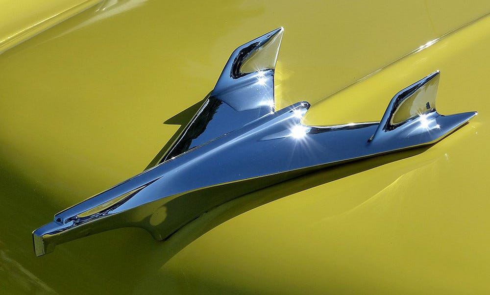
Although they’re a bit less noticeable on today’s cars than they were in the past, car “mascots” or hood ornaments reflected the artistic movements that informed car design and the general cultural taste of their age. Today, mascots are predominantly branding tools — think of the Mercedes-Benz “Three-pointed Star,” the Jaguar “Leaper,” the Bentley “Flying B,” but in the twentieth century, the car mascot was often a matter of customization (something still practiced in hot-rod car clubs). Mascots were a market and had a manufacturing base separate from car makers, so they could reflect the tastes of owners rather than proclaim a car maker’s brand.

A glance at the early mascots immediately reveals that what appeared on the car hood was a driver’s choice, not the car maker’s. In fact, on early cars the car maker probably would have mounted a temperature gauge, then known as the “motometer,” though some arranged for more ornamental pieces as well. The early car customers were wealthy, and so artistic flair served to distinguish car owners from the other wealthy Joneses in the neighborhood.
The result of this modest independence from car makers? Greater variety in matters of what appeared atop the radiator.

Among the most sought after collectibles today are glass ornaments created by René Lalique, who designed mascots in art deco style. Many are shapes of animal heads, and the glass designs had the advantage of being illuminated at the base, so that the mascot would glow at night. Lalique is also known for his design of the glasswork for the Orient Express.
Get more independent writing. I recommend The Sample. They send one newsletter sample a day. No obligation. You can subscribe if you like it.
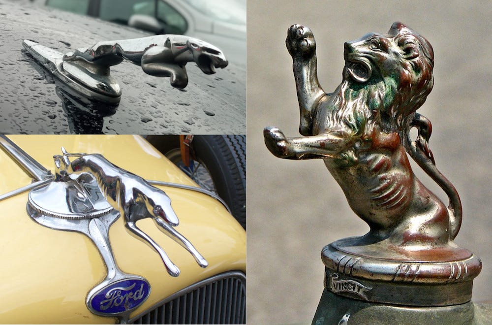
The fanciful mascots of the 1920s until World War II often depict living beings — birds, animals, amphibians, fish. And women and goddesses, whose lineage reaches into mythology. Some of these persist, however weakly, in car makers’ mascots. Even Jaguar has moved away from hood sculpture in recent years, opting instead to turn the “Leaper” into a chrome bas-relief or display a snarling cat on a metal disk.
Naturalistic mascots of the first half of the twentieth century evolved into sculpted images of man-made devices, smoothed as if by erosion. Pre-war winged goddesses transformed into flying machines modeled after the Lockheed P-38 Lightning, which served through World War II. The 1950s promised a new and faster age, as jet-powered civil aviation captured consumers’ attention. Mascot design followed such pervasive artistic influences.
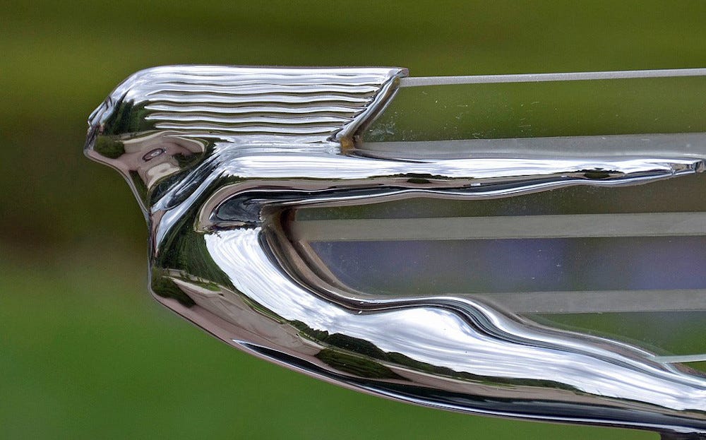
On car hoods, feathered flight gave way to jet-propelled aluminum, and feminine form became sleek and smooth, even aeronautical. Naturalistic evolved to art deco and then smoothed even more to jet-age form.
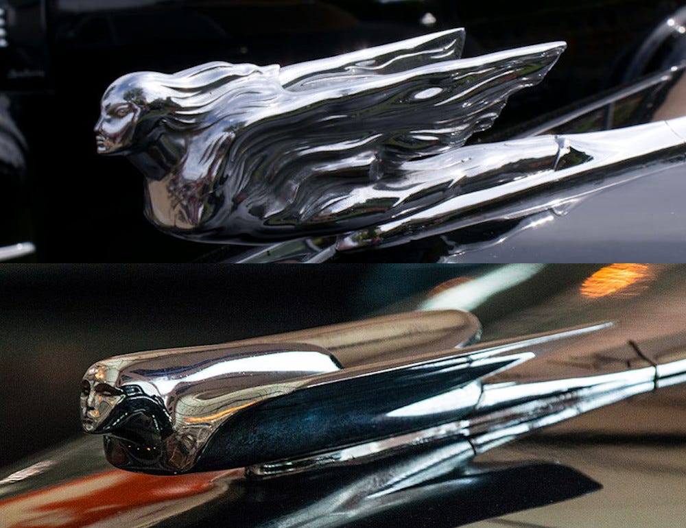
This evolution clearly unfolds on Cadillac hoods from the 1930s to the 1950s. Look at the image below. The upper half shows the mascot on a 1941 Cadillac, though this ornament was fitted on “Series 75” models as early as 1938, too. The bottom image shows the mascot on a model of the same series dating between 1947 and 1953. Even though both images depict the feminine form — a type of “winged goddess” common among several manufacturers — the treatments are strikingly different. The pre-war ornament is rich with detail — hairline and hair flowing in the wind, wings textured as if ruffled by the wind and generally echoing the famous Rolls-Royce Spirit of Ecstasy. The post-war Cadillac mascot reflects the streamlined styling of the time, and it recalls aircraft sleekness and design that later in the 1950s caused cars to sprout tailfins. Cadillacs led the way with fins, though they appeared on many American cars in the late 1950s and early 1960s.
The mascots go flat
Pedestrians impaled by the protruding ornaments caused car manufacturers to rethink their mascot designs. It’s not too difficult to imagine the pain and damage that the archer on a 1929 Pierce Arrow or even a Jaguar Leaper could inflict. Later, regulations further restricted their design, and, after mid-century, mascots fell out of favor, perhaps because of regulatory pressure and the simple fact they had become less artistic and varied. Besides, not everyone was happy with the explosions of chrome and ornament in the late 1940s and 1950s.
Raymond Loewy, Studebaker’s designer and stylist in the 1950s, wrote a trenchant article for The Atlantic entitled “Jukebox on Wheels.” Loewy bemoaned the ornamentation and chrome excess of car design:
“Some culture,” one might say as one watches the sad parade of the 1955 models. The world will soon forget that under these gaudy shells are concealed masterpieces of inspired technology. What we see today looks more like an orgiastic chrome plated brawl. There was another great American symbol, probably exported by the GI — the jukebox. Today’s jukebox moves! The automobile.
Loewy’s design principles didn’t include unnecessary baubles, and Studebaker’s styling sought to reflect the technology of the automobile. It was, in some sense, more European in spirit and sought a simpler elegance. Simplicity and function count. “I alienated the automotive industry by saying that cars should be lightweight and compact,” Loewy said in a 1979 New York Times article. “Who needs grills?” he said about his Avanti design. “Grills I always associate with sewers. I’d also kill chrome forever, or any other applied junk.”
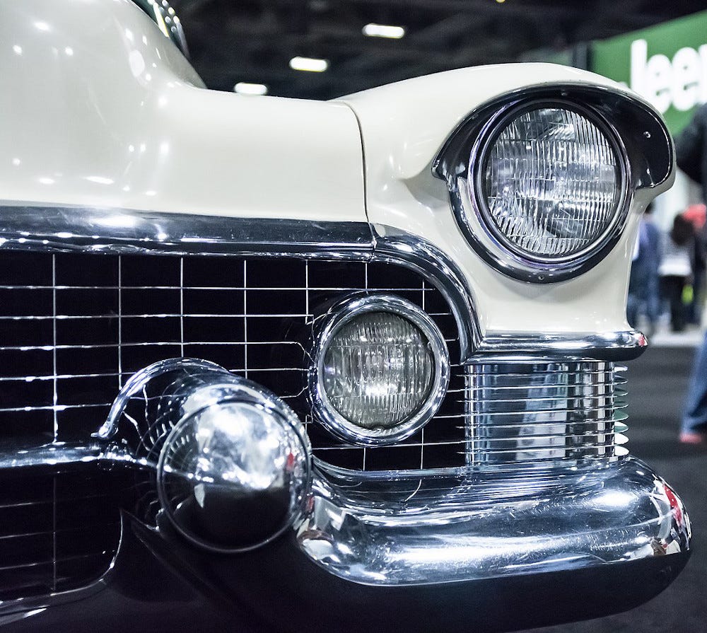
Loewy wasn’t wild about hood ornaments, and he may have resisted including one on a Studebaker’s hood — though he did not prevail. In the 1950s, Studebaker had them, too. But it has to be said that, despite Loewy’s design leadership, Studebaker didn’t carry the torch of elegant design much longer. The company’s last car was built on March 17, 1966.
I bet it was an Avanti.
Got a comment?
Photo credits
Is that a lady in the tire? Left: Herald mascot for a Cadillac, unknown date. Uploaded by Chuck Wyke. Pinterest (https://pin.it/UEPoOHD). Center: Female form within a circle, unknown date. Pinterest (https://pin.it/77OIvcz) Top right: Pontiac hood ornament, 1950s. Pinterest (https://pin.it/656t0Pt). Bottom right: 1955 Nash Rambler Custom Super. Pinterest (https://pin.it/7wYtLbV) Rights for all: Fair use.
Animals. Top left: Danković, Andrej. Hood Statue/Emblem of Jaguar X-Type. September 22, 2021. Digital photograph. Own work. https://commons.wikimedia.org/wiki/File:Jaguar_hood_statue.jpg. Bottom left: Atirador, Franco. Hood Ornament Ford. July 7, 2007. Digital photograph. Own work. https://commons.wikimedia.org/wiki/File:Hood_ornament_Ford.jpg. Right: O’Brien, Don. 1928 Franklin Hood Ornament. Seen at the Southern Ohio Corvette Club Classic Car Show in Waverly, Ohio. July 20, 2008. Digital photograph. Flickr photo. https://commons.wikimedia.org/wiki/File:1928FranklinHoodOrnamentDok1.jpg. Rights for all: CC-BY 2.0 Generic.
Tags: vintage car, mascot, hood ornament, automobile, art deco, streamlining, chrome, art
Links, cited and not, some just interesting
A really nice article on mascots that includes many photographs: Ŧhe ₵oincidental Ðandy. “Emblems of Speed: Vintage Automobile Mascots.” Blog, January 6, 2011. https://thecoincidentaldandy.blogspot.com/2011/01/emblems-of-speed-vintage-automobile.html.
Includes a very well done set of images showing the evolution of ornaments through model years for many car makers: Just A Car Guy. “Hood Ornament Identification Guide,” August 17, 2010. https://justacarguy.blogspot.com/2010/08/hood-ornament-identifiaction-guide.html. “Just A Car Guy” also includes many web addresses to explore hood ornament history and images. There is large community of mascot enthusiasts and collectors.
My Pinterest collection of car hood ornament images: https://pin.it/1R6o7EA. I sure wish that the images on Pinterest had more description and some statement of rights and reuse for each image.
The Wikimedia Commons has a great collection of hood ornament images: https://commons.wikimedia.org/w/index.php?go=Go&search=hood+ornaments&title=Special:MediaSearch&type=image
Crabby, maybe. Engaging, definitely. Loewy, Raymond. “Jukebox on Wheels.” The Atlantic, April 1, 1955. https://www.theatlantic.com/magazine/archive/1955/04/jukebox-on-wheels/303944/.
Interview and profile of Raymond Loewy. He seemed like a feisty character. Anderson, Susan Heller. “The Power of Streamlining.” The New York Times. November 4, 1979, sec. Design. https://www.nytimes.com/1979/11/04/archives/design-the-pioneer-of-streamlining-design.html.
Maybe the influence was from cars to jukeboxes? Smith, Karl. “Jukeboxes: The Unlikely Automotive Influence.” Car Design News, January 31, 2020. https://www.cardesignnews.com/features/jukeboxes-the-unlikely-automotive-influence/40070.article. “These new jukeboxes adopted details from cars — chrome bumpers, gold anodized aluminium, lights that looked like taillights or Dagmars, push buttons and selectors that emulated those on automotive instrument panels. Specific brands such as Cadillac and Chrysler were openly referenced in these designs and even specifically named by Seeburg and Rock-Ola.”


I find it fascinating that someone can be so fascinated by car mascots. Mind you, I'm not one to talk: I like looking at different designs of buses. A friend of mine loves railway sidings -- go figure! I guess it's a man thing. Anyway, I very much enjoyed reading this, and I even recognised the Pontiac one -- no idea how I could have known it.
Great post, Mark - really interesting! I love the diversity of these bonnet ornaments - 'Spirit of Ecstasy' and the Mercedes star are very different, but they are of course instantly recognisable as symbols of the brand.
These days it's all about branding, but I love how the early ornaments - the ones of beautiful ladies! - are very reminiscent of the figureheads of old ships, aboard which they were revered as symbols of hope and protection to safeguard a vessel in war and on perilous voyages.